12.6 ROC Curves
- ROC curves show the balance between sensitivity and specificity.
- We’ll use the [ROCR] package. It only takes 3 commands:
- calculate
prediction()using the model - calculate the model
performance()on both true positive rate and true negative rate for a whole range of cutoff values. plotthe curve.- The
colorizeoption colors the curve according to the probability cutoff point.
- The
- calculate
pr <- prediction(phat.depr, dep_sex_model$y)
perf <- performance(pr, measure="tpr", x.measure="fpr")
plot(perf, colorize=TRUE, lwd=3, print.cutoffs.at=c(seq(0,1,by=0.1)))
abline(a=0, b=1, lty=2)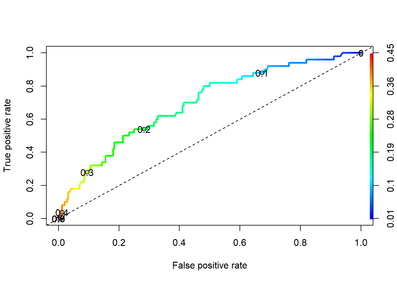
We can also use the performance() function to evaluate the \(f1\) measure
perf.f1 <- performance(pr,measure="f")
perf.acc <- performance(pr,measure="acc")

par(mfrow=c(1,2))
plot(perf.f1)
plot(perf.acc)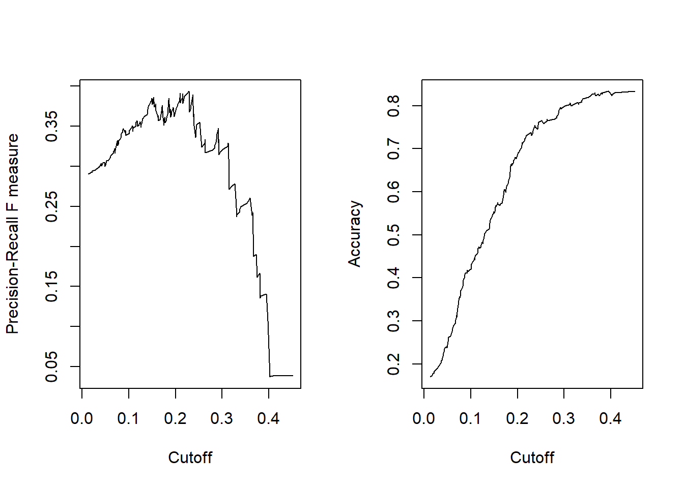
We can dig into the perf.f1 object to get the maximum \(f1\) value (y.value), then find the row where that value occurs, and link it to the corresponding cutoff value of x.
(max.f1 <- max(perf.f1@y.values[[1]], na.rm=TRUE))
## [1] 0.3937008
(row.with.max <- which(perf.f1@y.values[[1]]==max.f1))
## [1] 68
(cutoff.value <- perf.f1@x.values[[1]][row.with.max])
##       257
## 0.2282816
A cutoff value of 0.228 provides the most optimal \(f1\) score.
ROC curves:
- Can also be used for model comparison: http://yaojenkuo.io/diamondsROC.html
- The Area under the Curve (auc) also gives you a measure of overall model accuracy.