14.4 R commands
Calculating the principal components in R can be done using the function prcomp(), princomp() and functions from the factoextra package. This section of notes uses princomp() to generate the PCAs and helper functions from factoextra package. STHDA is a great reference for these functions.
14.4.2 Viewing the amount of variance contained by each PC
Use summary or get_eigenvalue to see the variance breakdown.
summary(pr)
## Importance of components:
##                            Comp.1    Comp.2
## Standard deviation     11.4019265 4.2236767
## Proportion of Variance  0.8793355 0.1206645
## Cumulative Proportion   0.8793355 1.0000000
factoextra::get_eigenvalue(pr)
##       eigenvalue variance.percent cumulative.variance.percent
## Dim.1  130.00393         87.93355                    87.93355
## Dim.2   17.83944         12.06645                   100.00000
The first PC (Comp.1) will always explain the highest proportion of variance (by mathematical design).
14.4.3 Vizualize Loadings
14.4.3.1 As a matrix of values
- The values for the matrix \(\mathbf{A}\) is contained in
pr$loadings. Alternatively theloadingsfunction will extract this matrix.
pr$loadings
##
## Loadings:
##    Comp.1 Comp.2
## X1  0.854  0.519
## X2  0.519 -0.854
##
##                Comp.1 Comp.2
## SS loadings       1.0    1.0
## Proportion Var    0.5    0.5
## Cumulative Var    0.5    1.0
loadings(pr)
##
## Loadings:
##    Comp.1 Comp.2
## X1  0.854  0.519
## X2  0.519 -0.854
##
##                Comp.1 Comp.2
## SS loadings       1.0    1.0
## Proportion Var    0.5    0.5
## Cumulative Var    0.5    1.0
\[ C_{1} = 0.854x_1 + 0.519X_2 \\ C_{2} = 0.519x_1 - 0.854X_2 \]
14.4.3.2 As a vector plot
To visualize how these two new PC’s create new axes these new axes, we plot the centered data.
a <- pr$loadings
x1 <- with(data, X1 - mean(X1))
x2 <- with(data, X2 - mean(X2))

plot(c(-40, 40), c(-20, 20), type="n",xlab="x1", ylab="x2")
points(x=x1, y=x2, pch=16)
abline(0, a[2,1]/a[1,1]); text(30, 10, expression(C[1]))
abline(0, a[2,2]/a[1,2]); text(-10, 20, expression(C[2]))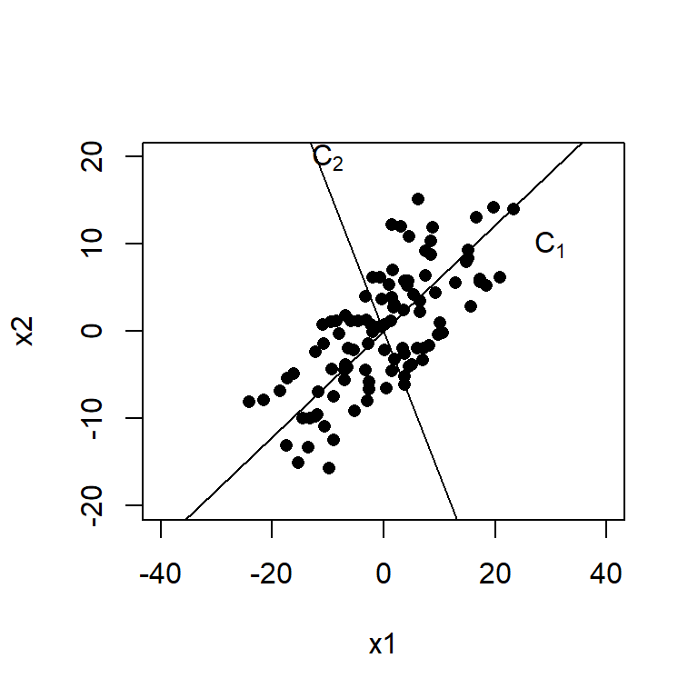
Another useful plot is called a biplot. Here the PC’s are on the dominant axes, and the red vectors show you the magnitude and direction of the original variables on this new axis.
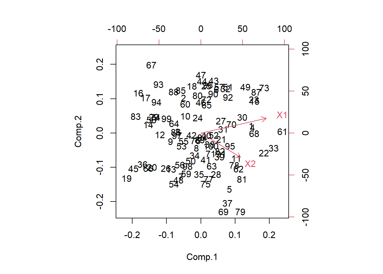
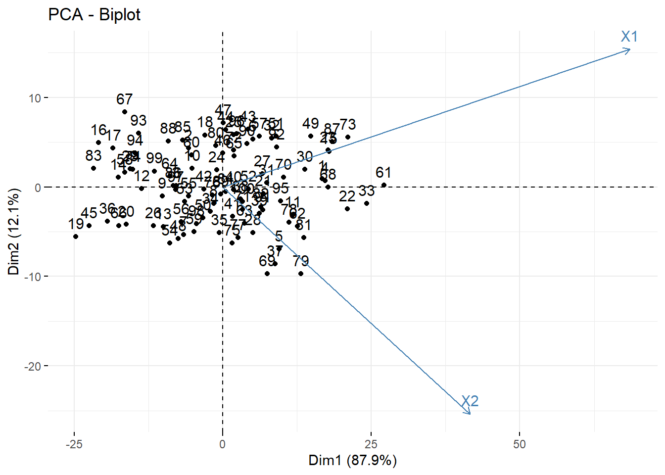
- X1 is positively correlated with both PC1 and PC2
- X2 is positively correlated with PC1 but negatively correlated with PC2.
This information was also seen in the loading values.
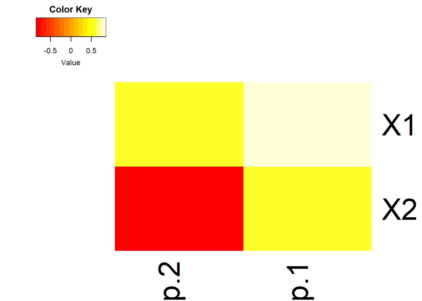
14.4.3.3 As a heatmap
- Often in high dimensional studies, the loadings are visualized using a heatmap.
- Here we use the
heatmap.2()in thegplotspackage. I encourage you to play with the options such asdendogramandtraceto see what they remove/add, and review the?heatmap.2help file.
14.4.3.4 As a strength of reprensetation
Contribution of rows/columns to the PC’s. For a given dimension, any row/column with a contribution above the reference line could be considered as important in contributing to the dimension.
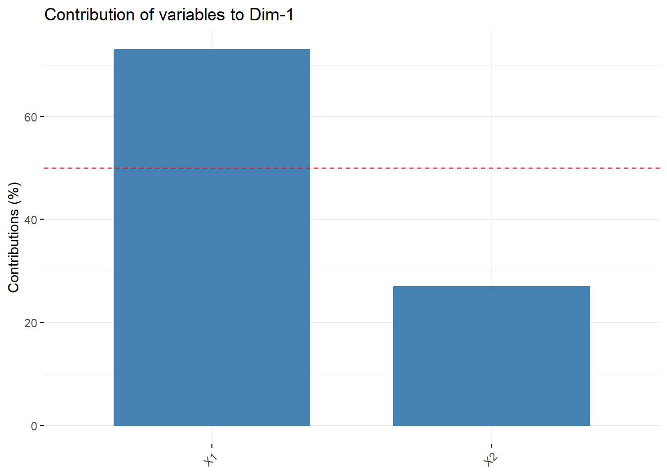
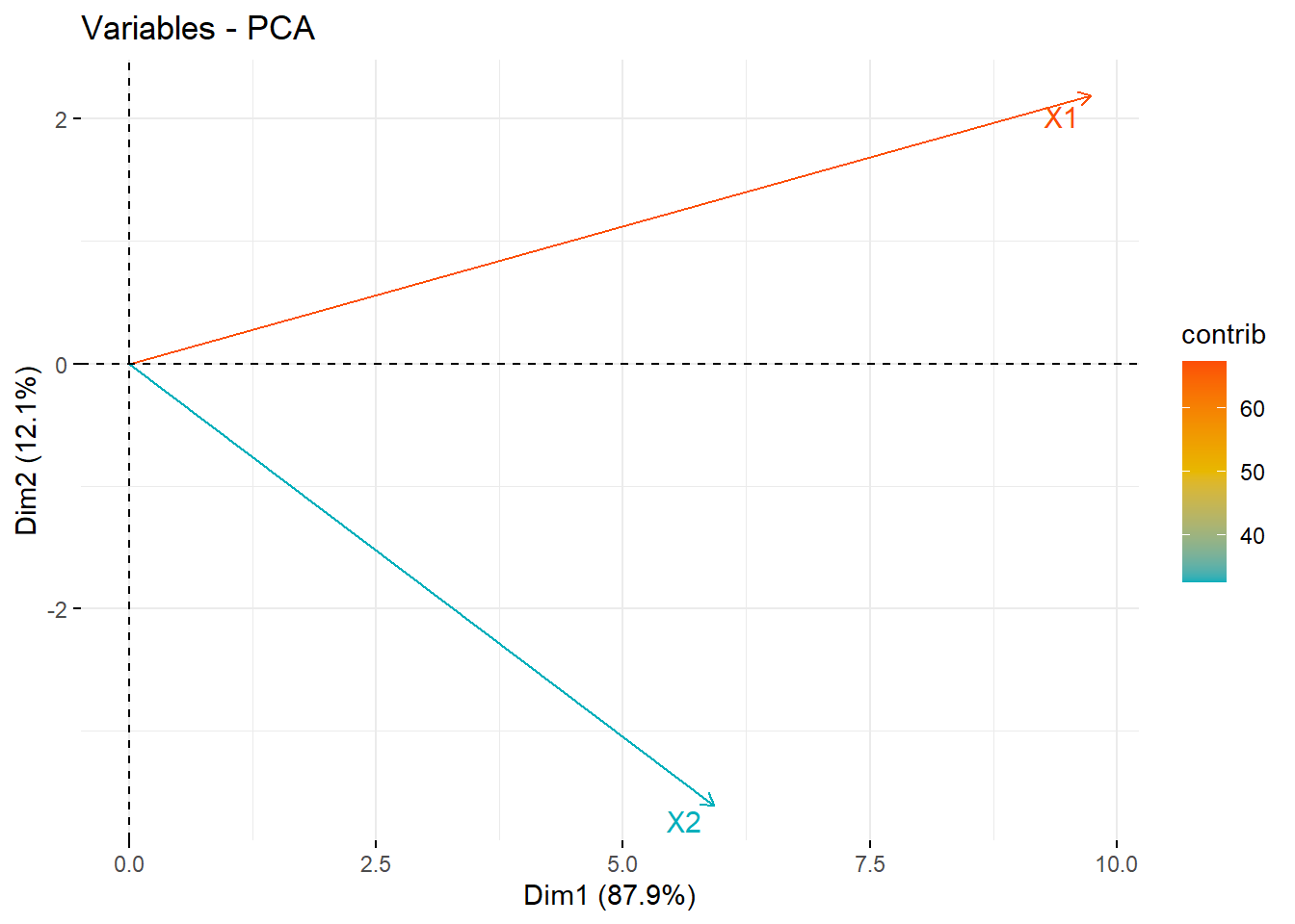
X1 contributes more than half of the amount of information to PC1 compared to X2
14.4.3.5 As a correlation circle
With only 2 PC’s this isn’t that informative. The later example and the vignette are likely more helpful.
See STDHA correlation circle for detailed information.
fviz_pca_var(pr, col.var = "contrib", axes=c(1,2),
             gradient.cols = c("#00AFBB", "#E7B800", "#FC4E07"),
             repel = TRUE # Avoid text overlapping
             )