9.5 Presenting results
The direct software output always tells you more information than what you are wanting to share with an audience. Here are some ways to “prettify” your regression output.
- Using
tidyandkable
| term | estimate | std.error | statistic | p.value |
|---|---|---|---|---|
| (Intercept) | -2.761 | 1.138 | -2.427 | 0.016 |
| FAGE | -0.027 | 0.006 | -4.183 | 0.000 |
| FHEIGHT | 0.114 | 0.016 | 7.245 | 0.000 |
- Using
gtsummary
| Characteristic | Beta | 95% CI1 | p-value |
|---|---|---|---|
| FAGE | -0.03 | -0.04, -0.01 | <0.001 |
| FHEIGHT | 0.11 | 0.08, 0.15 | <0.001 |
| 1 CI = Confidence Interval | |||
- Using
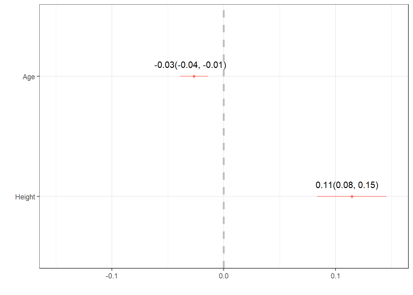
dwplotfrom thedotwhiskerpackage to create a forest plot.
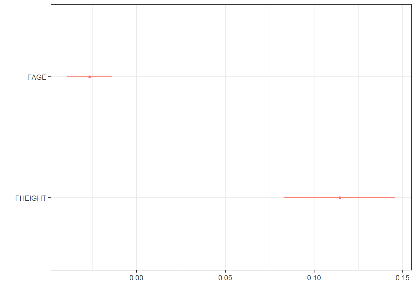
- Improvement on
dwplot- extract the point estimate & CI into a data table, then add it as ageom_textlayer.
text <- data.frame(                               # create a data frame
  estimate = coef(mlr.dad.model),                 # by extracting the coefficients,
  CI.low = confint(mlr.dad.model)[,1],            # with their lower
  CI.high = confint(mlr.dad.model)[,2]) %>%       # and upper confidence interval values
  round(2)                                        # round digits

# create the string for the label
text$label <- paste0(text$estimate, "(", text$CI.low, ", " , text$CI.high, ")")

text                                              # view the results to check for correctness
##             estimate CI.low CI.high               label
## (Intercept)    -2.76  -5.01   -0.51 -2.76(-5.01, -0.51)
## FAGE           -0.03  -0.04   -0.01 -0.03(-0.04, -0.01)
## FHEIGHT         0.11   0.08    0.15    0.11(0.08, 0.15)
text <- text[-1, ]                                # drop the intercept row

# ---- create plot ------
mlr.dad.model %>%                                  # start with a model
  tidy() %>%                                       # tidy up the output
  relabel_predictors("(Intercept)" = "Intercept",  # convert to sensible names
                     FAGE = "Age",
                     FHEIGHT = "Height") %>%
  filter(term != "Intercept") %>%                  # drop the intercept
  dwplot() +                                       # create the ggplot
  geom_text(aes(x=text$estimate, y = term,         # add the estimates and CI's
                label = text$label),
            nudge_y = .1) +                        # move it up a smidge
  geom_vline(xintercept = 0, col = "grey",         # add a reference line at 0
             lty = "dashed", size=1.2) +           # make it dashed and a little larger
  scale_x_continuous(limits = c(-.15, .15))        # expand the x axis limits for readability