18.1 Identifying missing data
- Missing data in
Ris denoted asNA - Arithmetic functions on missing data will return missing
survey <- MASS::survey # to avoid loading the MASS library which will conflict with dplyr
head(survey$Pulse)
## [1]  92 104  87  NA  35  64
mean(survey$Pulse)
## [1] NA
The summary() function will always show missing.
summary(survey$Pulse)
##    Min. 1st Qu.  Median    Mean 3rd Qu.    Max.    NA's
##   35.00   66.00   72.50   74.15   80.00  104.00      45
The is.na() function is helpful to identify rows with missing data
The function table() will not show NA by default.
table(survey$M.I)
##
## Imperial   Metric
##       68      141
table(survey$M.I, useNA="always")
##
## Imperial   Metric     <NA>
## 68 141 28- What percent of the data set is missing?
4% of the data points are missing.
- How much missing is there per variable?
prop.miss <- apply(survey, 2, function(x) round(sum(is.na(x))/NROW(x),4))
prop.miss
##    Sex Wr.Hnd NW.Hnd  W.Hnd   Fold  Pulse   Clap   Exer  Smoke Height    M.I
## 0.0042 0.0042 0.0042 0.0042 0.0000 0.1899 0.0042 0.0000 0.0042 0.1181 0.1181
##    Age
## 0.0000
The amount of missing data per variable varies from 0 to 19%.
18.1.1 Visualize missing patterns
Using ggplot2
pmpv <- data.frame(variable = names(survey), pct.miss =prop.miss)

ggplot(pmpv, aes(x=variable, y=pct.miss)) +
  geom_bar(stat="identity") + ylab("Percent") + scale_y_continuous(labels=scales::percent, limits=c(0,1)) +
  geom_text(data=pmpv, aes(label=paste0(round(pct.miss*100,1),"%"), y=pct.miss+.025), size=4)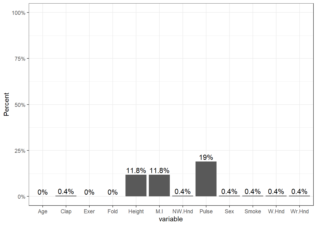
Using mice
##     Fold Exer Age Sex Wr.Hnd NW.Hnd W.Hnd Clap Smoke Height M.I Pulse
## 168    1    1   1   1      1      1     1    1     1      1   1     1   0
## 38     1    1   1   1      1      1     1    1     1      1   1     0   1
## 20     1    1   1   1      1      1     1    1     1      0   0     1   2
## 7      1    1   1   1      1      1     1    1     1      0   0     0   3
## 1      1    1   1   1      1      1     1    1     0      0   0     1   3
## 1      1    1   1   1      1      1     0    1     1      1   1     1   1
## 1      1    1   1   1      0      0     1    0     1      1   1     1   3
## 1      1    1   1   0      1      1     1    1     1      1   1     1   1
##        0    0   0   1      1      1     1    1     1     28  28    45 107
This somewhat ugly output tells us that 168 records have no missing data, 38 records are missing only Pulse and 20 are missing both Height and M.I.
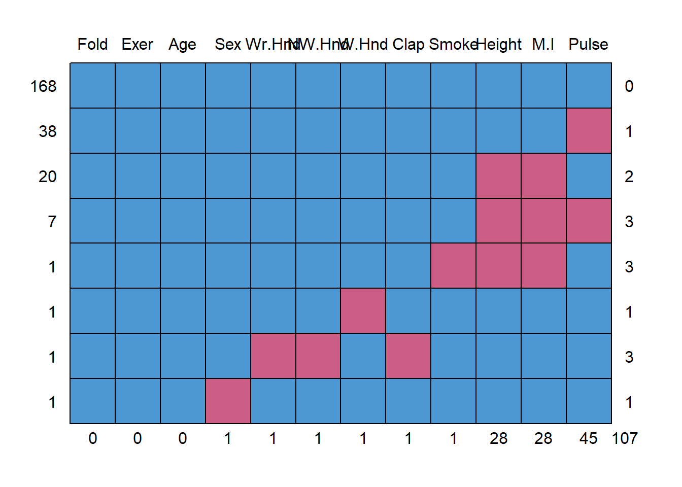
Using VIM
library(VIM)
aggr(survey, col=c('chartreuse3','mediumvioletred'),
              numbers=TRUE, sortVars=TRUE,
              labels=names(survey), cex.axis=.7,
              gap=3, ylab=c("Missing data","Pattern"))
The plot on the left is a simplified, and ordered version of the ggplot from above, except the bars appear to be inflated because the y-axis goes up to 15% instead of 100%.
The plot on the right shows the missing data patterns, and indicate that 71% of the records has complete cases, and that everyone who is missing M.I. is also missing Height.
Another plot that can be helpful to identify patterns of missing data is a marginplot (also from VIM).
- Two continuous variables are plotted against each other.
- Blue bivariate scatterplot and univariate boxplots are for the observations where values on both variables are observed.
- Red univariate dotplots and boxplots are drawn for the data that is only observed on one of the two variables in question.
- The darkred text indicates how many records are missing on both.

This shows us that the observations missing pulse have the same median height, but those missing height have a higher median pulse rate.