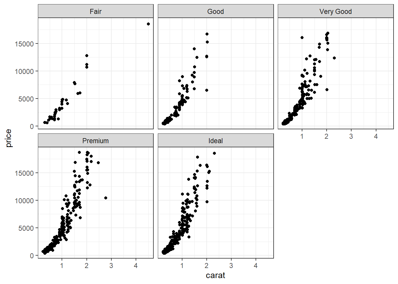
2.7 Multivariate (3+ variables)
This is not much more complicated than taking an appropriate bivariate plot and adding a third variable through paneling, coloring, or changing a shape.
This is trivial to do in ggplot, not trivial in base graphics. So I won’t show those examples.
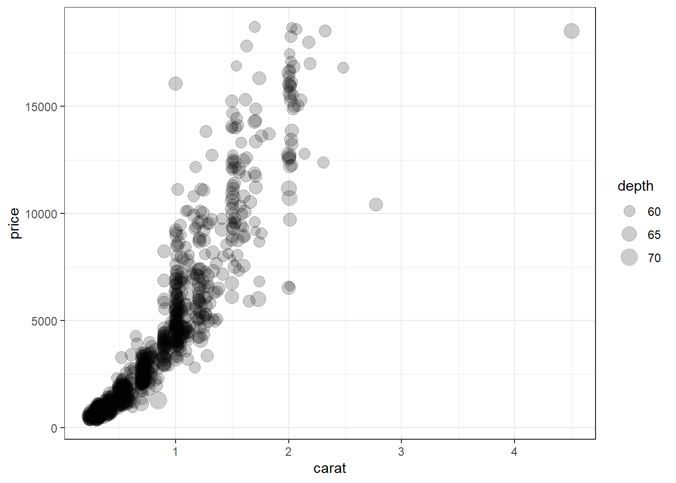
2.7.1 Three continuous
Continuous variables can also be mapped to the size of the point. Here I set the alpha on the points so we could see the overplotting (many points on a single spot). So the darker the spot the more data points on that spot.
2.7.2 Scatterplot matrix
A scatterplot matrix allows you to look at the bivariate comparison of multiple pairs of variables simultaneously. First we need to trim down the data set to only include the variables we want to plot, then we use the pairs() function.
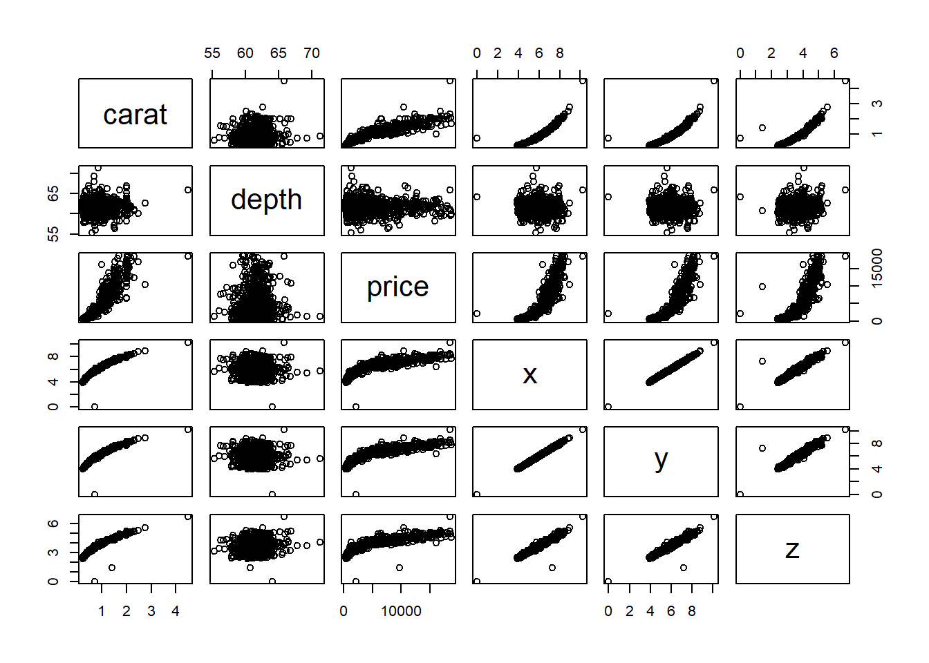 We can see price has a non-linear relationship with X, Y and Z and x & y have a near perfect linear relationship.
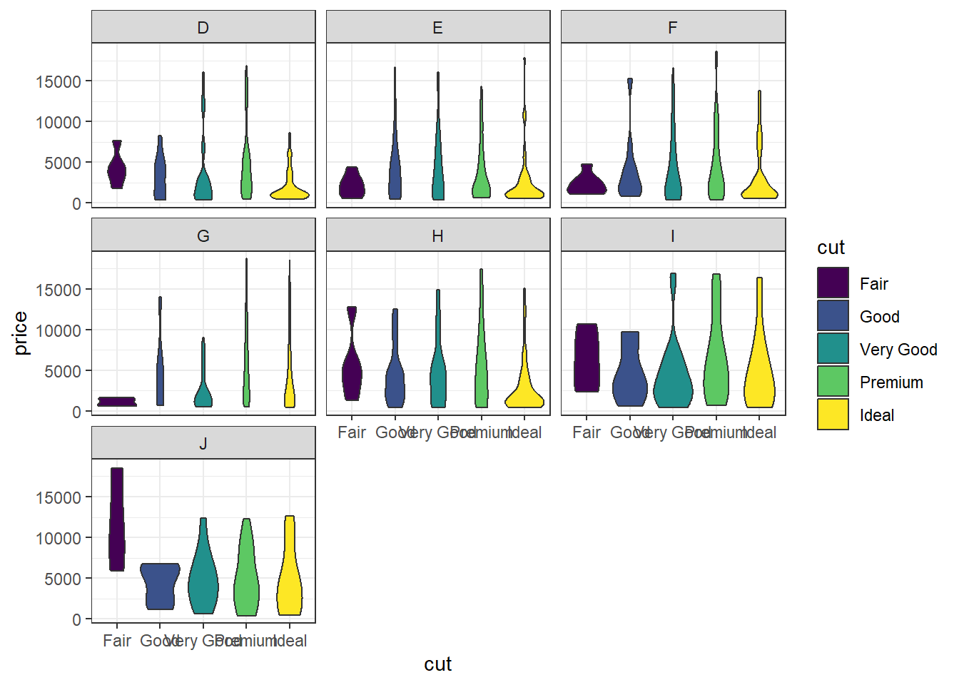
2.7.3 Two categorical and one continuous
This is very similar to side by side boxplots, one violin plot per cut, within each level of color. This is difficult to really see due to the large number of categories each factor has.
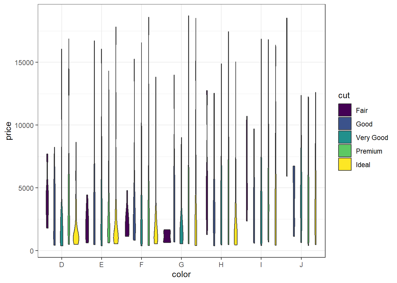
Best bet here would be to panel on color and change the x axis to cut.
2.7.4 Two continuous and one categorical
a <- ggplot(dsmall, aes(x=carat, y=price, color=cut)) + geom_point() + ggtitle("Colored by cut")
d <- ggplot(dsmall, aes(x=carat, y=price, color=cut)) + geom_point() +
      geom_smooth(se=FALSE) +ggtitle("Lowess line per cut")
grid.arrange(a, d, nrow=1)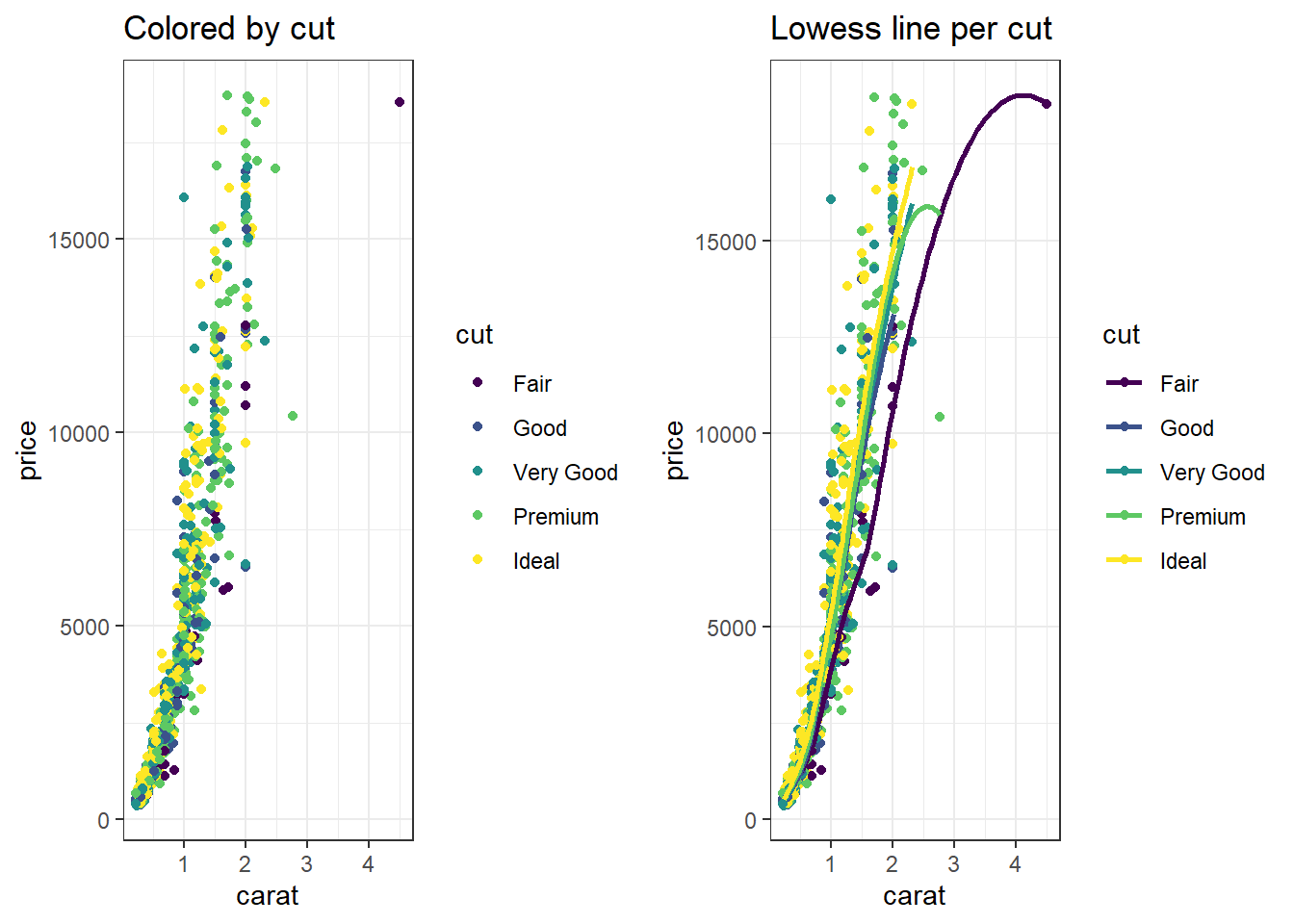
Change the shape
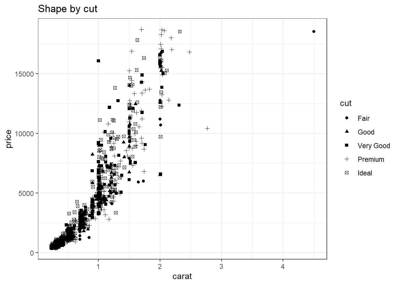
Or we just panel by the third variable